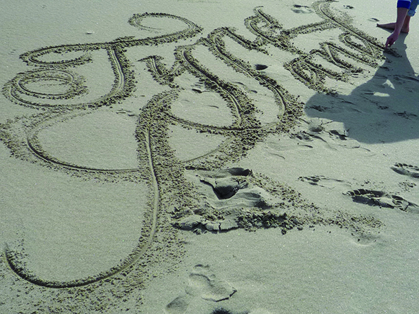
Letters… Hoe maak je ze? In Den Haag bevindt zich een van de meest gerenommeerde opleidingen voor ‘Type & Media’. Een paar jaar geleden sprak ik met een van de docenten en mailde ik met diverse ex-studenten. Dit leidde een paar jaar geleden een artikel in DH///. Wat Indipendenza wil weten: wat houdt letters ontwerpen eigenlijk in?
1 november 2020 / 3408 woorden / 26 minuten leestijd / Eerder gepubliceerd in DH/// in 2013 (63-66), bewerkt in 2020 / Copyright beeldmateriaal is afgestemd met alle betrokkenen
Ik sprak destijds af met Jan-Willem Stas, docent op de Type & Media-opleiding (onderdeel van de KABK) in Den Haag. Met een kop koffie en een stukje appeltaart in Dudok aan het Spui proberen we het mysterie van de studie en het vak te ontrafelen. Waarom willen zoveel buitenlandse talenten hier les krijgen? Wat houdt letters ontwerpen in? Hoe verschilt het ontwerpen van letters in het digitale tijdperk van letters ontwerpen vroeger?
Eerst iets belangrijks: het verschil tussen letters en lettertypen. In het Engels uitgelegd door oud-student Gustavo Ferreira:
“‘Font’ and ’typeface’ mean different things for people who work in the field. A typeface is a design: a collection of ideal typographic shapes, independent from any implementation (to make a loose analogy with music: a composition). A font, on the other hand, is a particular implementation of a typeface for a specific medium and technology, in a specific format etc (continuing the music analogy: a recording or performance).”
Ben je voor je gaat lezen nog behoeftig aan nog iets meer uitleg over wat typografie en letterontwerpen inhouden? Lees dan eerst dit blog (Engelstalig). Nu terug naar het interview met Jan-Willem Stas.
Van een fax naar digitale letters: interview met Jan-Willem Stas
We gebruiken ze allemaal dagelijks maar voor veel mensen is het ontwerpen van letters een ver-van-hun-bed-show. Kun je iets meer voor de leek iets meer uitleggen over de geschiedenis van letterontwerpen?
De industrie werd heel lang gedomineerd door twee monopolisten: Linotype en Monotype. Zij maakten machines die zetwerk in lood vervaardigden. Daardoor bepaalden zij ook welke lettertypen er op de markt kwamen. De Linotype zetmachine goot een vaste regel. Monotype was een systeem waarbij afzonderlijk losse letters werden gegoten. Bij Linotype moest bij een tiepfout de hele regel over, bij Monotype kon je de verkeerde letters vervangen.
Door de opkomst van het offset drukken in de jaren zestig van de vorige eeuw veranderde de vraag van loden zetwerk naar fotografisch zetwerk. Beide ontwikkelden nieuwe systemen, maar er kwamen ook andere spelers op de markt, vooral uit de fotografische industrie. Nog steeds bepaalden zij het letteraanbod, omdat nieuwe lettertypen een grote investering vergden. Veel van de typografische verfijningen uit het loodtijdperk gingen daardoor verloren.
Wat is de invloed van de opkomst van de computer op het ontwerpen van letters?
Met de komst van de computer is het letterontwerpen democratischer geworden. Dat begint met de geschiedenis van Icarus. Icarus was een programma dat was ontwikkeld door een Duits bedrijf (URW). De gedachte was toen: als we nu een computer hebben in Europa en een in Amerika, dan kunnen we alle bestaande lettertypen wel digitaliseren. Petr van Blokland heeft op basis van dat programma Icarus-M gemaakt in 1987, zodat het op de Apple-Macintosh kon draaien.
Daarna zijn er andere letterprogramma’s gekomen, Fontographer, Font studio. De geest was uit de fles. Je kon letterontwerpen op de keukentafel met een Mac, een scanner en een printer. Nu zijn er al weer verbeterde ontwerp programma’s als Fontlab en Robofont, ontwikkeld door Frederik Berlaen met Petr van Blokland.
In the mid-Eighties there was hardly a computer to be seen at the Royal Academy. Working by hand was the norm. That was pleasant because you learnt to deal with letters and words in a very direct and physical way. Typography under Gerrit Noordzij was in the first place writing and seeing how forms arise on paper. There were computers, but their place was at home.
Jan Middendorp & Erik van Blokland / letterror.com
The Type and Media masters program has a long history at the Koninklijke Academie van Beeldende Kunsten in The Hague. The roots of the program can be traced back to Gerrit Noordzij’s Letter Programme within the graphic design department at KABK during the 1970s. (…) In 2002, the Type and Media program officially started in its present incarnation.
Abi Huynh / source
Het eerste half jaar worden verschillende aspecten van letterontwerp aangeboden: kalligrafie, letters hakken, lettertekenen, niet Latijnse schriften, digitaliseren, programmeren. Het tweede halfjaar werk je aan een zelf voorgesteld onderwerp. Medestudenten kwamen uit Brazilië, Duitsland, Libanon, Canada, Zweden, Zwitserland, Letland (mijn jaar). Ex-t/m-studenten vormen samen een “familie”, vaak werken we samen, nodigen we elkaar uit.
Frederik Berlaen / via e-mail
Wat heeft het digitale tijdperk veranderd op het gebied van letters ontwerpen?
Je faxte een bestelling naar een van de vele letteruitgeverijtjes en dan kreeg je na betaling een floppy in een envelop thuis gestuurd. Dat veranderde pas toen FontShop, een bedrijf dat letters ging verkopen van verschillende letteruitgeverijen en ontwerpers, in 1991 een catalogus uitbracht. Toen had je eindelijk zicht op de het letteraanbod in de wereld.
We hebben in 1998 een conferentie georganiseerd in Rotterdam (THype) om dat bedrijf, FontShop, eigenlijk een postorderbedrijf met kleurige foldertjes, een gezicht te geven en om een aantal letterontwerpers op het podium te zetten. We hadden toen al wel een website maar dat was toen nog iets nieuws. Dat kun je je nu al bijna niet meer voorstellen.

Wat maakt de Type & Media-opleiding in Den Haag zo bijzonder in Europa?
Alle docenten, met uitzondering van mijzelf, zijn letterontwerpers. De Werkplaats typografie in Arnhem is een master vooral gericht op typografie, net als de bachelor opleiding in Swäbisch Gmünd, waar we vaak studenten vandaan krijgen. Daar worden soms ook letters ontworpen. Maar die zijn meer als idee, concept om een eigen gezicht aan de typografie te geven.
Wij zijn echt een hardcore opleiding in letterontwerpen. Ook de opleiding aan de Hochschule in Leipzig, waar Fred Smeijers lesgeeft, is dat. Andere opleidingen in opkomst zijn ECAL in Lausanne en de Hochschule in Zürich, waar onze oud-studenten lesgeven.
En waar in verhouding staat dan de letterontwerpenopleiding in Reading?
De opleiding is Reading is vergelijkbaar met de onze. Er wordt ook wel eens gezegd dat er competitie is tussen Reading en de KABK, maar dat is niet echt zo. Het is wel een meer universitaire opleiding en ze moeten een uitgebreidere thesis schrijven. Terwijl wij meer ‘learning by doing’ hebben. Bij ons staat het schrijven en tekenen centraal. Daar doen veel mensen twee jaar over de opleidiing, terwijl wij na een jaar we wel klaar met ze zijn.
Als je in Londen gaat studeren, zit je wel met huisvestingsproblematiek, plus dat de kosten van de studie een stuk hoger liggen. Bij ons zijn de studie kosten voor de master nog gelijk aan de bachelor. Het komt vaak voor dat wij iemand afgewezen hebben en de student alsnog naar Reading gaat. Dan blijkt iemand wel een passie te hebben om te weten, niet om te tekenen. Je ziet studenten daar vervolgens erg interessante research doen. Overigens leren we de studenten wel programmeren want anders blijft het monnikenwerk. Dat is niet meer zo van deze tijd.
Hoe wordt iemand uiteindelijk geaccepteerd op de opleiding?
We krijgen voor elk studiejaar zo’n tachtig à negentig serieuze portfolio’s binnen die we dan met elkaar gaan vergelijken. Daaruit kiezen we er dan twaalf. Er zijn ook veel studenten die twee of drie keer een poging wagen. Daar is ook niets op tegen. Het is vaak ook beter om na een opleiding in ontwerpen eerst praktijkervaring op te doen. Als je daarna weer besluit om te gaan studeren, ben je gretiger. De selectie is een moeilijke klus als je iemand niet hebt ontmoet. Eigenlijk kan een student met een bachelor in ontwerpen overal vandaan komen. Uit de portfolio moet wel een liefde spreken voor het met letters bezig zijn. Dat zie je toch vooral in de schetsen.
Wat er zo bijzonder is aan het vak van letterontwerper (’type designer’) in 18 quotes
KICK
I can’t explain it; I just like looking at type. I just get a total kick out of it. Other people look at bottles of wine or whatever, or, you know, girls’ bottoms. I just get kicks out of looking at type. It’s a little worrying, I must admit.
Erik Spiekermann / ilovetypography.com
AUDACITY
One of my favourite memories from my KABK education was an off-hand quote by an instructor who mentioned: “At the top of culture there is music, just below that there is type design.” I found the audacity of the statement amusing and humorous. To this day I’m not sure if he was joking or not.
WOMEN IN TYPE DESIGN
It is a fact that there are fewer women than men in type design. Though there are many skilled and educated female type designers, they just do not get much attention. Verena Gerlach, a German type designer, wrote an article about it called ‘Where Are the Women in Type Design’, in which she explains the reasons why type design is such a man’s world. From this article: “For most designers it’s difficult to find an end and be satisfied with the result. Then you add the expectations of others, amplified by the gender gap. Women constan4tly think they could do better. It’s never enough, they could get judged, they have to please, etc.
Slávka Pauliková & quote by Verena Gerlach
INCORRUPTIBLE CRITIQUE
The core of the experience in the TypeMedia course is hard work, incorruptible critique and a growingly sharp perception of the tiniest detail. For the craft part, drawing letters is all about being precise. This accuracy, once acquired, is almost impossible to unlearn again. For the creative part, you learn to think more in possibilities and to let go your first ideas. You have to try out many things to be able to make a choice for the best solution. Finally, almost every student runs into specific problems in her or his project that can hardly be generalized. In this regard, you learn to keep on trying to make it work.
EXPLORING TYPEFACES
I’ve been teaching typography at graduate and undergraduate level and my approach is heavily based on the way I was taught. The most crucial aspect of the method is trying to make students understand how formal and aesthetic decisions in contrast, proportions, weights, features etc, make certain fonts more adequate than others to ‘solve’ typographical problems. This notion of drawing to specific contexts and exploring typefaces according to how and maybe why they were designed is a direct application of a small yet fundamental part of KABK’s knowledge.
DESIGNING DIGITAL WORLDS
Screen-based documents are interconnected, dynamic, reactive; screens are ‘dark’ surfaces in which information is written with light. These radically different qualities demand different typographic solutions and ideas, which lie necessarily outside of the tradition of print typography. Most of my type-design work is targeted at screen media rather than print. I try to work with the unique qualities of digital media: embracing the pixel grid, and exploring colors, computation, interaction etc. The Elementar system is an attempt to bring more typographic flexibility to screens. It is an alternative approach to type-design for screens: instead of working with scleable outline fonts, I have designed several individual size-specific typefaces along parametric variation axes. (And tools and interfaces to deal with these fonts.)
THE SMALLEST ELEMENTS OF GRAPHIC DESIGN
I think the appeal of type design is in working with the smallest element of graphic design, almost all forms of graphic design require typography, whether it is for a book or a website or corporate branding. I think what appeals to me is the challenge of crafting type with a very particular personality and atmosphere to suit each project. I love working with details and the pursuit of type design is about as detail-oriented as you can get.
RIPPING OFF
Making a good typeface is a lot of work. Stealing a typeface seems easier. But ripping off a typeface and claiming it as one’s own is counter-productive, uncreative, and in general corrosive to type and typography. This fails to contribute anything. (…) Pirates have no interest in type, they have an interest in the use that people have for type. (…) If a typeface was made by someone else, it would have been different, even if the intent was to make the same thing. It is that collection of personal, specific decisions and opinions that make a typeface useful, appropriate, good or bad, that is its value. That also makes a typeface undeniably the intellectual property of its designer.
Erik van Blokland / letterror.com
NEW FONTS
Typefaces grow with typography and graphic design, and they change all the time. There are many fonts, but the one that you need might be missing. Also, despite the work that has been done before, it is possible to have new ideas, just as it is possible (and necessary) to write a new book, or take a new photograph.
Just van Rossum en Erik van Blokland / letterror.com
150.000 FONTS
It seems to be a golden age of type design—not only are there more type foundries now than ever before, not only is distribution easier and more direct, not only is type a hot topic for numerous specialised blogs and magazines, but even the general interest media are in on the conversation, (if only occasionally). New type design courses are opening regularly, churning out legions of type designers. And there are now over 150,000 fonts available for direct download. (…) Just as in the music industry, where cover versions and remixes are often more popular than new music, font designers seemingly prefer to exploit successful models from the past rather than strive for new solutions. (…) Many people drawing type today have solid drawing skills, but no desire to advance the field (let alone rebel against it) by creating original solutions. Can we call them type designers? I think not, at least not any more than we can call every fast, accurate typist a writer.
Peter Bil’ak / typotheque.com
CAREFULLY CONSIDERED IMPERFECTION
Had people not been searching for centuries for the roundest circle, the most flexible curve, the clearest line? With the computer this was as easy as falling off a log. Add razor-sharp definition by using offset on smooth modern paper, and the result is the best print ever. Engineers get the warm fuzzies when confronted with such perfection. The question is whether the ordinary reader wants such an overdose of perfection. After all, a completely balanced page of text can also be completely boring. (…) By allowing the computer to mess around within the — strictly defined — margins of a virtual font or layout, a new sort of liveliness can arise. In that case the computer is not used as the big leveler that it only too often is, but as a way of introducing carefully considered imperfection.
Jan Middendorp & Erik van Blokland / letterror.com
TYPECOOKER
Perhaps I most enjoyed the TypeCooker experiments. The assignment was to draw letters from a randomly generated recipe TypeCooker recipe. I discovered many things by taking a pencil in my hand to draw the sketches. When I looked over the sketches of my classmates, they had unique approaches based on the very same recipe. (…) And it made me realize how important it is to use your hands to sketch.
Kunihiko Okano in an interview with Taro Yumiba / source
BEING A PROFESSIONAL GRAFFITI ARTIST
In my early puberty I did a lot of grafitti. If I compare this letters with my bachelor thesis I can see similarities. (…) For me typedesign is a little bit like being a professional graffiti artist. It is a bit more complicated, because there is more to letters than just the words they form. However, you always feel happy if you see your typeface in use. And the really good thing? It is legal.
ARROGANCE CAN SOLVE THE PROBLEM
I listen quite carefully to what clients have to say, then I throw everything away and start to think for myself. Usually I come up with an approach which is utterly different from what they asked me, and I try to convince them. They sometimes see me as completely arrogant and not worth telling anything to. However, I must say that most of the clients realize that I also react to them. I try to respond to their direction, solve the problem, take them seriously, but not by trying to give them wine or please them — instead I am interested in what they could do with their organization or approach. I don’t mind at all if I have to argue with them. I act like I’m an independent artist in that sense.
René Knip in interview met Jon Glarbo / source
PLAYING THE BASS
Typography and typeface design live in the intersection between visual and verbal language, so they tend to attract people who are equally interested in both these worlds, and in how they interact. People who are mostly into visual language go into graphic design, photography, painting and so on, while people who are more into verbal language go into writing, researching, poetry etc. Type design in particular requires is a very systematic way of thinking: a typeface is the sum of several individual form elements (arches, bowls, stems, serifs, hooks etc) which only interact and emerge through text. It also requires an ability to shift between foreground (the ‘black’ shape) and background (the ‘white’ counter shapes), and a sense for rhythm and repetition – it is not a coincidence that many type-designers also play(ed) the bass (myself included).
LETTERS ARE EVERYWHERE
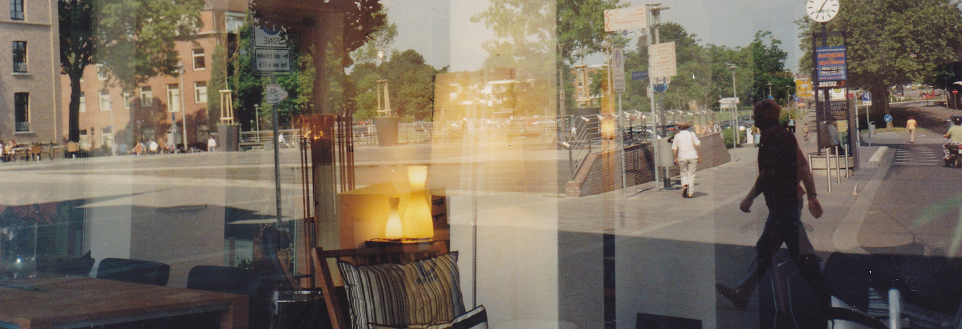
Most designers I know appreciate the large variety of subjects they basically are able to work on. It has something sporty to it: what’s the new job, what’s the target, what can I come up with? I personally love to work with and for places, to design shops, cafés, restaurants. It is extremely interesting to work between the identity of a business and the architecture and public space it is situated in. If the design of a store front comes out well, it is very satisfying to see it act into the street. As letters are everywhere in our daily surroundings today, they should be beautiful everywhere.
JUST LIKE MUSIC
What fascinates me about letters and applied typography are three things. First of all, typefaces are graphical systems that are reduced to a manageable set of rules to which every letter has to bend. On the other hand, these rules have to be followed warmheartedly to let it live and breathe. It’s just like in music. Secondly, letters carry semantic value, they are not all the same, they do transport feelings, associations and connotations. But they do so in a much more unconscious way to general public than pictures do. Letters always embody a speaker’s voice. Just as poetry uses words to create worlds, letters use shapes to create sound. Finally, written letters and typography are a major cultural heritage, in their forms as much as in their content. There is no history without writing and writing has it’s own history. The more I learn about the history of letters, how they were made, what they were intended for, what larger context they sit in, the more I am under their spell.
TYPEFACE FOR MARS
A typeface for a new civilization on Mars sounds like the ultimate challenge: unheard of, refreshing and interesting. For such a job would really need to widen my boundaries into new territories, which is a necessity for the creative survival of a designer.
Veel dank aan alle betrokkenen voor hun hulp bij het tot stand komen van het originele artikelen. En voor alle letterfetisjisten: excuses voor de ongetwijfeld minder fraaie belettering op deze pagina…
Meer lezen, kijken of luisteren?
- KABK: Type & Media / afgestudeerden: 2013, 2014, 2015, 2016, 2017, 2018, 2019.
- I love Typography (interviews)
- Letteror
- Typotheque
- Eye Magazine
- Lessons learned at Type Media
- OhnotypeCo@Medium So you want to apply at type media?
- Reddit/r/typedesign
- Typotalks
- Freetypograhy: interviews
- Print: 26 articles for typography lovers
- Jan Middendorp in Eye Magazine Is type design losing its soul?
- Mathieu Christe/Berton Hasebe: Type and media masters
- The New York Times: These people really care about fonts
- Designboom: interview met Peter Bi’lak